Building a public Figma component library
 Alex Chan
- December 4, 2023
- 4 min read
Last week, we launched our first Figma community file: a component library encapsulating all of our off-the-shelf UI components. It’s a great way to quickly add Dopt-powered onboarding and education experiences to your designs (and it’s super customizable to boot!).
Today, we’ll share how we structured and built this community file with Figma best practices.
File structure
Your community file’s structure is extremely helpful when users want to dive deeper into how things are hooked up so it is often worth the effort upfront to get it right. This is also an opportunity for you to provide helpful content like inline documentation and links alongside variables, styles, and components. The first page in your file is showcased immediately once the user lands on the community file so make a good impression!
Our file’s page structure looks like this:
- 👋 Welcome – File cover, how to use the file, and helpful links
- –––
- 🎨 Theme – Variables and styles showcase
- ⭐️ Icons – Reusable icon components (we used icons from Tabler)
- 💠 Shared Components – Subcomponents used throughout the main components
- –––
- Modal
- Tour
- Checklist
- Hint
- Card
Using divider pages can help separate categorical groups of pages and further aid in the visual organization of your community file. It can also be helpful to change the background color of the divider page to make it clear that there’s no content.
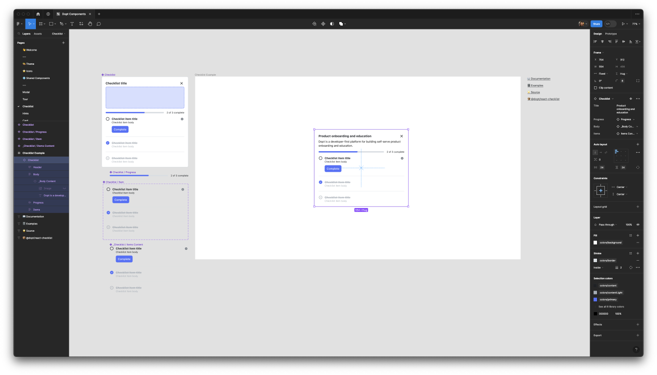
Each component has its own dedicated page which houses its subcomponents, an example of how to use the component in Figma, and helpful links to our documentation and additional examples.
Variables and styles
We wanted users to be able to leverage our component library as a true library so we built it using Figma variables and styles. Building with these features in mind allows users to further reuse and customize our components in a more systemic way rather than copying or creating one-off overrides (of course you can still do that if you want to!).
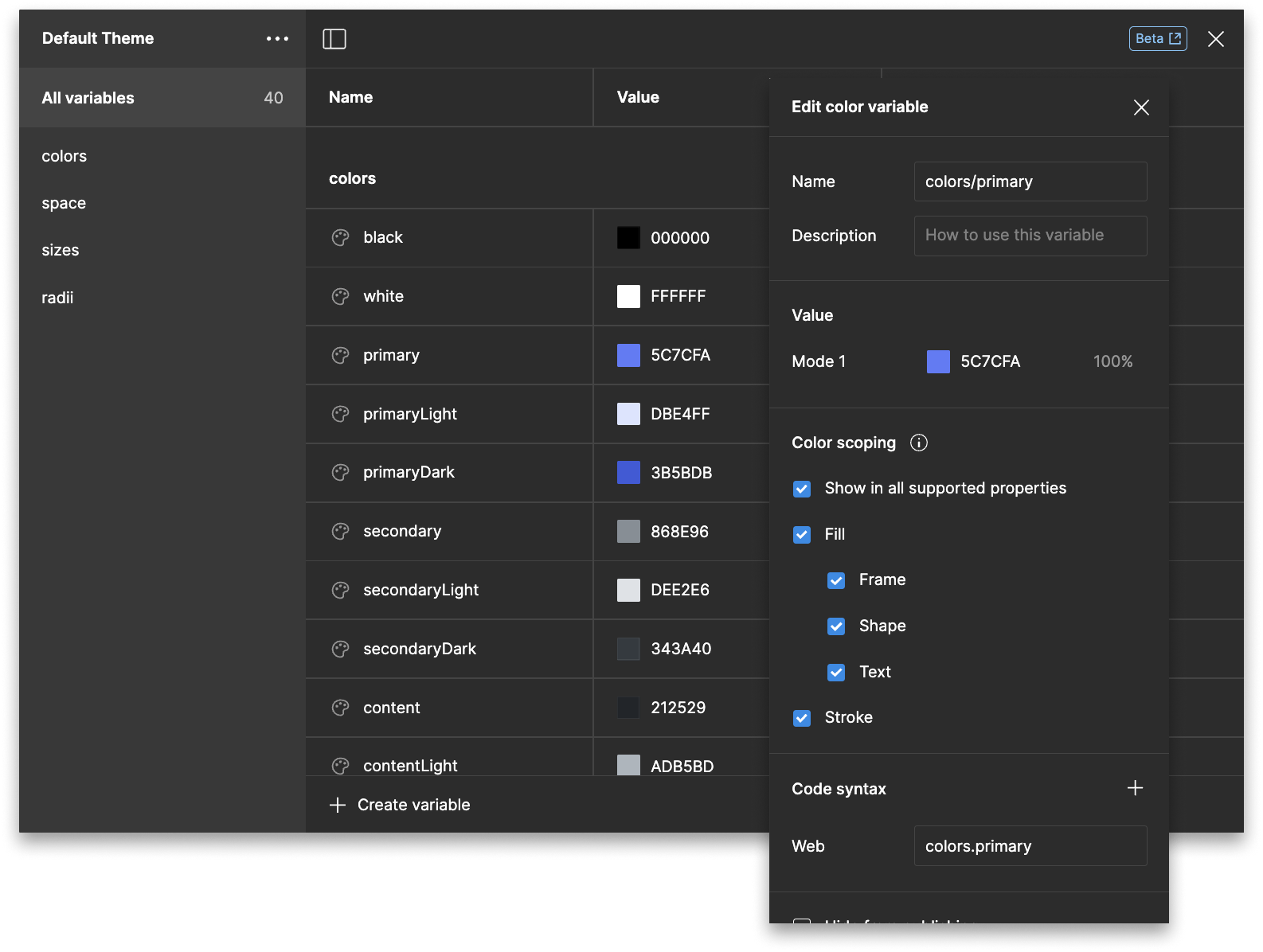
Figma’s variables feature is great for defining reusable design tokens. You can group tokens by type (color, size, etc.) and also scope (i.e., restrict) them to certain properties. For example, you can scope a color variable to only be applicable to text fills. The variables feature is still in beta, but support has been great so far.
We encoded our color, space, size, and radius tokens as variables. These map one-to-one to the tokens we’ve surfaced as part of our component theme in code and can be customized just as easily. By using variable collections (sets of variable values), users can toggle between the default theme and any number of custom themes.
Go the extra mile and fill out the code syntax for your variables to match how they’re defined in code so users using Dev Mode can get the proper tokenized values.
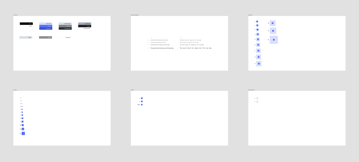
We found that variables weren’t (yet) compatible for storing typography (font, font size, and line height) or shadow tokens so we used text and layer styles to encapsulate those instead.
As we alluded to above, we created a 🎨 Theme page to showcase all of these variables and styles in one place. This page is extremely helpful for previewing variable collections.
Component anatomy
To make our components as versatile as possible, we set some guidelines for how components should be constructed:
- All internal elements should leverage proper scaling through auto layout
- Name layers consistently and semantically
- Apply variables and styles where possible
- Enable composition by separating out elements into subcomponents
- Don’t overuse properties, instead favor composition
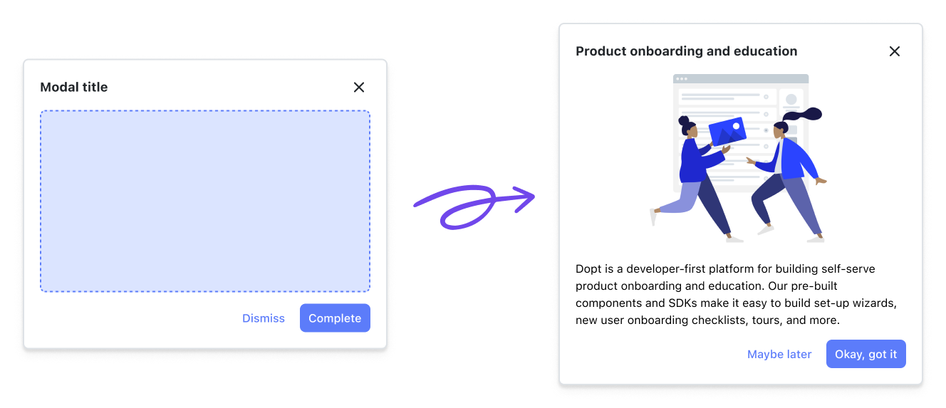
Separating out certain elements into subcomponents allowed us to take advantage of the instance swap property which makes components much more robust without requiring users to detach from the main instance. For example, we decoupled the body content of most components and set it to a placeholder that can be replaced via an instance swap to enable users to input their own body content (powered by rich text!) as they see fit.
We also knew that there would be a few common subcomponents such as icons and buttons that would be shared amongst the main components so we separated those out into the ⭐️ Icons and 💠 Shared Components pages.
If the goal is for users to use your file like a library, you may want to consider hiding components that are not essential to their usage to reduce component clutter. For example, we’ve hidden the icon components in our file.
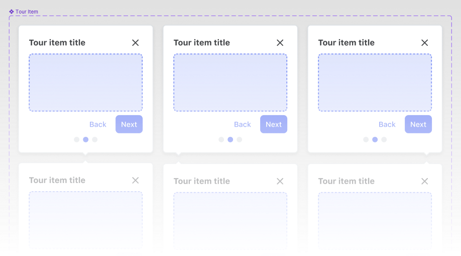
For components that did have some level of consistent configuration, such as the alignment and position of a tour item, we leveraged component variants.
While it can be tempting to hook up every configurable aspect of a component to a property, sometimes it helps to keep things simple. We found that using too many properties made components overly complex, so we opted out of implementing some text and boolean properties.
Before you publish
Figma has some great documentation on how to add your file to the community so we won’t go into detail about that here. Instead, here’s a checklist of pre-publish tasks that you can go through to make sure your file is ready for primetime:
- ✅ Glam up your community profile page with a photo, cover image, bio, and links
- ✅ Make sure your file cover image is correctly sized (1920 x 960, but with a safe area of 1600 x 960 — Figma will crop to the safe area when showing the cover as a thumbnail)
- ✅ Think of a good name for your file. It should be descriptive, but not overly verbose.
- ✅ Write up a description for your file. This might include a list of features/components, how-tos, or background information. You can even include links!
- ✅ Come up with tags (up to 12) to help users discover you in the community
- ✅ Determine which account you’ll be publishing under (yours or your organization’s)
- ✅ Test your components in real world situations. Resize them. Add different types of copy. Change up variables and styles.
If you’ve checked all of these boxes, then you’re ready to publish! Don’t worry if you realized that you missed something later, you can always go back and publish updates to any part of your community file.
What’s next?
So you’ve published your file. Now what?
It’s important to remember that a community file is an asset that you’re putting out into the world and to treat it like you’re releasing a new feature. Monitoring metrics and prioritizing changes and updates against the rest of your backlog are things that you should be doing.

Monitor how much usage and how many likes you’re getting to gauge if you need to find other distribution channels besides what’s built into the community itself. Figma doesn’t have first class features to do this just yet, but you can check how many times it’s been used or liked by going to the file’s community page. Community assets can grow in popularity organically, but most of the time they need a little nudge.
Make sure you’re appropriately linking to your community file on your website, documentation, and even in-product. Try reaching out in design communities to spread the word. X, formerly Twitter, can be a good starting point to engage with fellow designers. And lastly, don’t forget to monitor any comments you might get on your file (if you’ve enabled them).
If your library is like ours, it’s going to continue to grow. For instance, we plan on adding more components down the line to keep parity with our code components. Pairing a changelog and a semver system with your library file can be helpful for consumers to understand what has changed and what new things have been added.
We hope this guide alongside our component library file has been helpful! If you’re looking to design and build great onboarding and education experiences, get started for free with Dopt.