Launch Week Day 2: Hints component and custom fields
 Phil Vander Broek
- November 7, 2023
- 2 min read
Welcome to Day 2 of Dopt Launch Week 🚀
We’re excited to launch a new hints component and custom component fields.
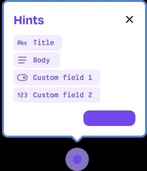
Effortlessly build hints into your product
The new hints component is a set of composable UI primitives you can use in your product. Hints (sometimes called hotspots) are great for calling attention to UI elements to help users discover new features, provide contextual help, or nudge them toward a good next step. They work well because a user will discover them in the natural course of using your product.
Hints demo
Watch Joe, our CTO, build hints with custom fields into a product in just a few minutes.
Composable hints UI primitives
There’s a range of ways to use our components depending on your needs.
We offer an open-source Hints React component to help you get up and running quickly. Our React components are highly composable and themeable. Our components are a collection of primitives and completely customizable — we offer guidance on how to arrange them, you can choose what you want, and you can mix in your own components.
Flexible SDKs for hints behaviors, states, and content
Our SDKs make it easy to build hints by providing behaviors (e.g. hint.complete()), states (e.g. hint.finished), and content (e.g. hint.completeLabel ).
By keeping these concepts separate from the UI primitives we provide, you get to choose how you use them with our UI or yours!
We offer first-class SDKs for React and Vue. We also offer a JavaScript SDK that will work with any front end.
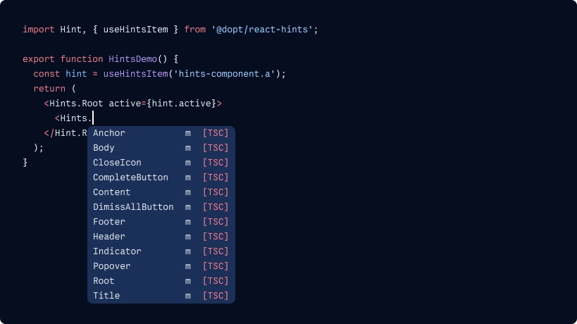
Here’s how it looks in code:
import Hint, { useHintsItem } from '@dopt/react-hints';
function NavigationHint({ children }) {  const hintItem = useHintsItem('hints-component.navigation-link');
  const toggle = () => hintItem.setOpen(!hintItem.open);  const close = () => hintItem.setOpen(false);
  return (    <Hints.Root active={hintItem.active}>      <Hints.Anchor>        <button style={{ position: 'relative' }}>          <Hints.Indicator onClick={toggle} />        </button>      </Hints.Anchor>      <Hints.Popover position="bottom" open={hintItem.open}>        <Hints.Content>          <Hints.Header>            <Hints.Title>{hintItem.title}</Hints.Title>            <Hints.CloseIcon onClick={close} />          </Hints.Header>          <Hints.Body>{hintItem.body}</Hints.Body>          <Hints.Footer>            <Hints.CompleteButton onClick={hintItem.complete}>              {hintItem.completeLabel}            </Hints.CompleteButton>          </Hints.Footer>        </Hints.Content>      </Hints.Popover>    </Hint.Root>  );}
Check out an interactive hints example and code repo →
Model content and configuration with custom component fields
Custom fields enable you to add content fields to any component block in Dopt (modal, checklist, tour, hints, card, and custom blocks). You can think of fields like a lightweight CMS.
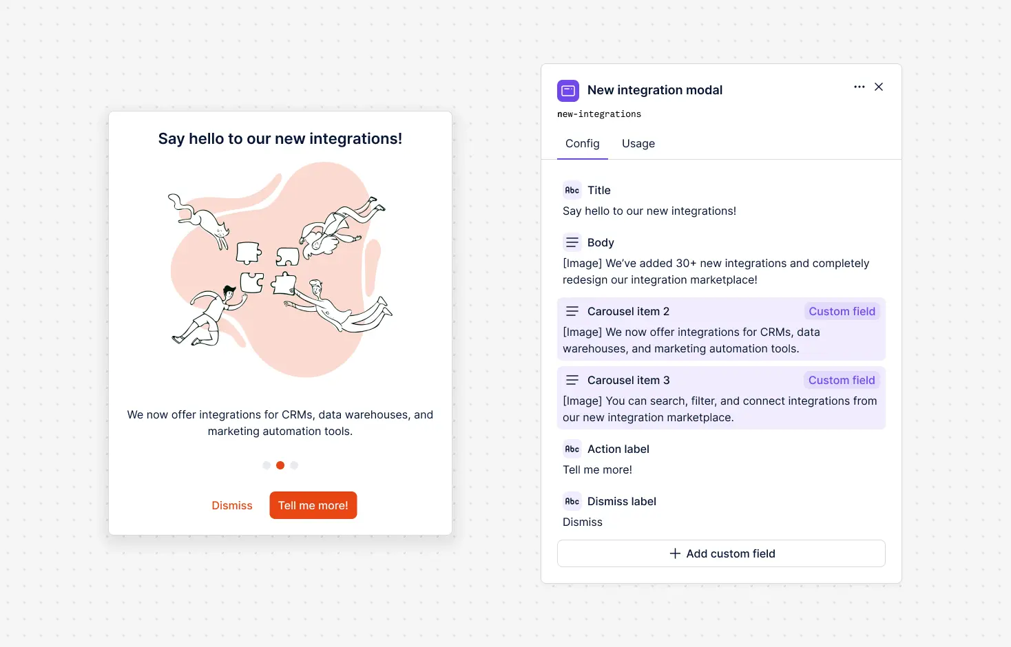
Custom fields give you the flexibility to extend a Dopt component to match your specific needs, like working seamlessly with the content and configuration of the components in your design system.
You could:
- Add custom fields to a modal component to create an announcement modal with a 3 section carousel
- Add a custom field on tour to control an extra button text and link
- Add a custom field on checklist items to add an image to each item (we did this!)
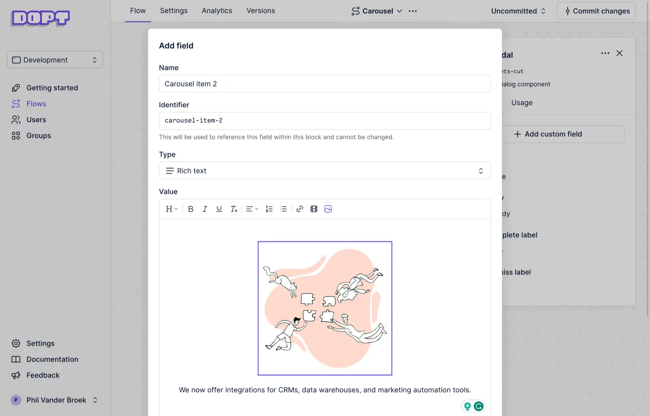
Like all fields in Dopt, non-developers can define the fields and update the content of a field without a code push. You can add string, boolean, rich text, and number fields.