Most React components offered by products aren’t usable. Why ours are different.
 Joe McKenney
- August 17, 2023
- 5 min read
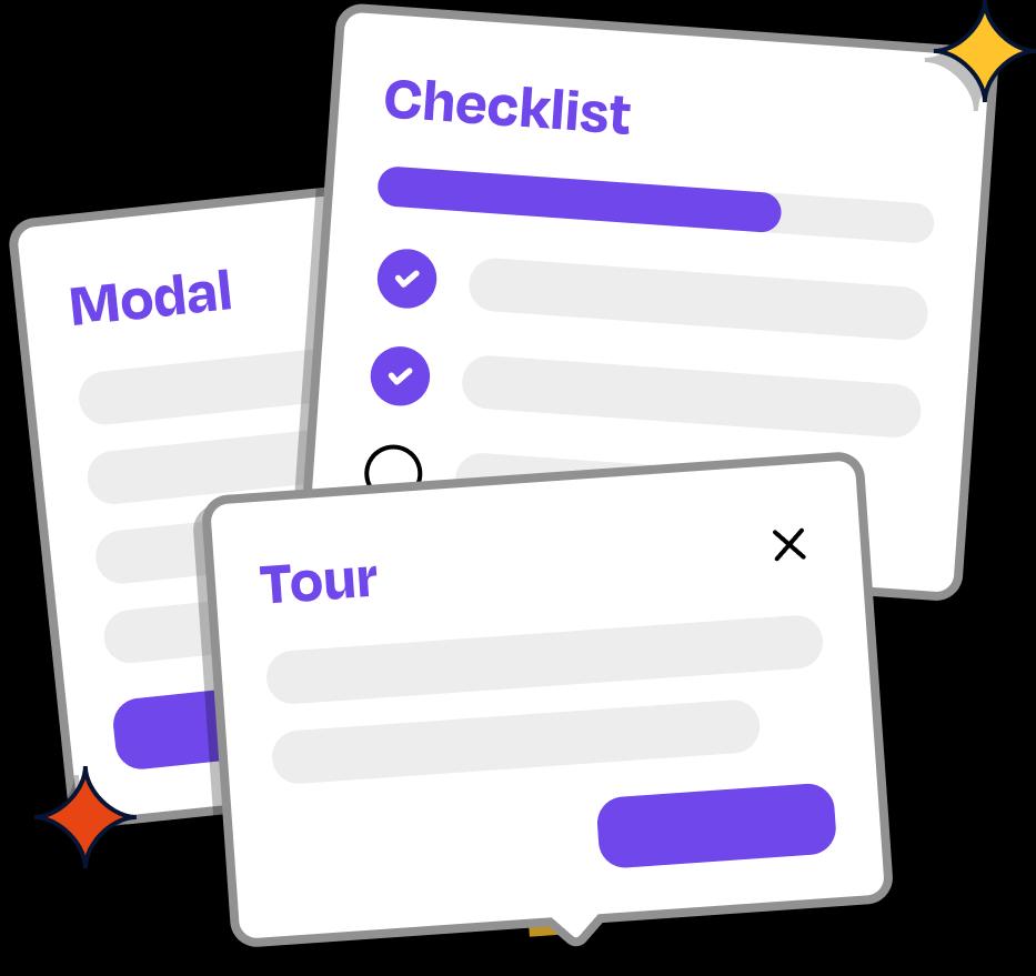
First, a bit about Dopt. Dopt is a platform that can power onboarding and education experiences in your product. We offer a component library (more on this below!), SDKs and APIs for building self-serve product onboarding and education, e.g., getting started checklists, tours, contextual tips, etc.
Products come in many shapes and sizes, and their users’ journeys vary accordingly. How you create experiences that help your users discover and understand the value of your product should be up to you. This is why we started with a headless solution. APIs and SDKs to power your experiences, leaving the UI up to you, the builder. We started here for a few reasons.
- Building UI isn’t necessarily the hard part (there are tons of great design systems that offer high-quality components off of the shelf e.g., React Aria, Radix UI)
- Delivering a solution via UI components has the potential to conflate business logic with presentation, which doesn’t scale to the varied use cases we’ve seen in the wild.
But we always knew there was an opportunity to offer UI. From working with early customers, we learned that providing UI is solving more than just building it; UI Components can do the following.
- Help users understand what they can and should build.
- Offer best practices out of the box.
- Avoid folks reinventing the wheel.
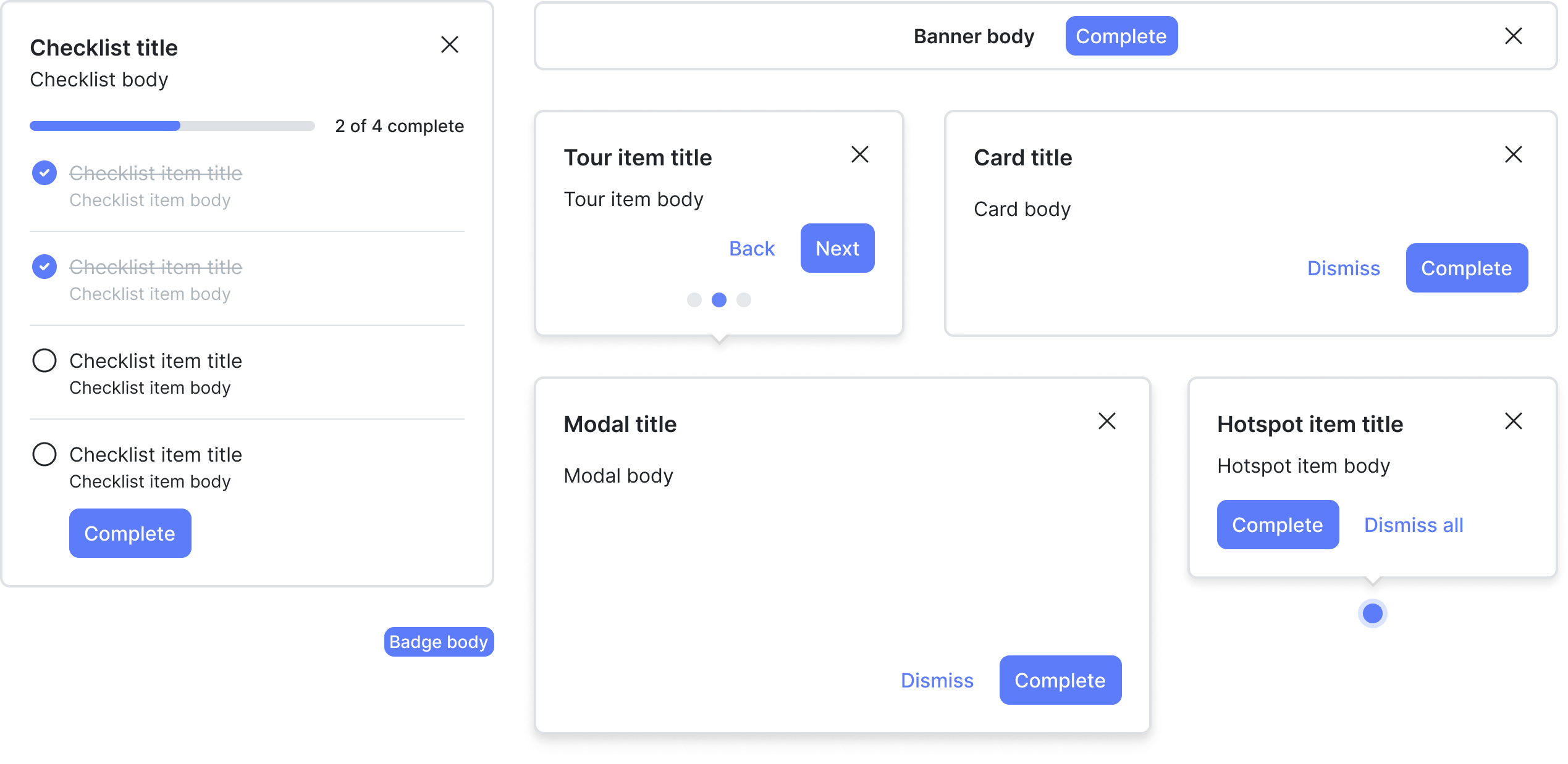
- Offer growth-centric components/modalities that aren’t available in typical design systems (checklists, tours, hot spots, etc).
There were a few considerations when we set out to build UI components.
- They should be flexible enough to solve common onboarding and education use cases.
- They should package up component-specific behaviors and state independent of presentation, giving users full control over how they build, e.g., their UI or ours.
For us, flexibility meant that our components shouldn’t be configured; they should be composed (or opened in Radix terms). A simple example of the two is as follows.
<ConfiguredChecklist title={checklist.title} onDismiss={checklist.dismiss} showProgressBar={true} items={[ { title: 'Set up your first integration', completed: false, dismissed: false, onComplete: () => {}, onDismiss: () => {}, onClickToNavigate: () => {}, }, { title: 'Invite your coworkers to your workspace', completed: false, dismissed: false, onComplete: () => {}, onDismiss: () => {}, onClickToNavigate: () => {}, }, ]}/><ComposedChecklist> <Checklist.Header> <Checklist.Title>{checklist.title}</Checklist.Title> <Checklist.DismissIcon onClick={checklist.dismiss} /> </Checklist.Header> <Checklist.Progress value={checklist.count('done')} max={checklist.size} /> <Checklist.Items> <Checklist.Item> <Checklist.ItemContent> <Checklist.ItemTitle> Set up your first integration </Checklist.ItemTitle> <Checklist.ItemBody>{item.body}</Checklist.ItemBody> {!item.done && ( <Checklist.ItemCompleteButton onClick={item.complete}> Done </Checklist.ItemCompleteButton> )} </Checklist.ItemContent> </Checklist.Item> <Checklist.Item> <Checklist.ItemContent> <Checklist.ItemTitle> "Invite your coworkers to your workspace" </Checklist.ItemTitle> <Checklist.ItemBody>{item.body}</Checklist.ItemBody> {!item.done && ( <Checklist.ItemCompleteButton onClick={item.complete}> Done </Checklist.ItemCompleteButton> )} </Checklist.ItemContent> </Checklist.Item> </Checklist.Items></ComposedChecklist>Nearly all modern component libraries for React (the library we are targeting initially) utilize composition as the primary pattern for authoring UI, which makes sense; it’s a core design principle of React. Yet, many developer-focused platforms (analogous to Dopt) only offer configured UI components. Why? Here are a few possible reasons.
- It’s much easier for the author/maintainer easier to build configured components than composable components (particularly when the components conflate presentation and business logic, e.g., abstract way API requests associated with user interactions)
- It’s just a marketing ploy/gimmick to get folks in the door/funnel; and one that has serious tradeoffs/drawbacks in real usage
The problem with offering configured components is that they are rigid and inflexible. They hinder the consumer from doing the following.
- Hard to change presentation (e.g., subbing your own
<Button />component for the one provided, removing elements from the component, using your styles/theme/tokens, etc) - Hard to change behaviors (e.g., changing where you navigate to on a click of a certain element or adding an informational tooltip on hover).
But these requirements are all quite natural. We know that look (presentation) and feel (behaviors) matter when putting experiences into your product. We want our experiences to be tightly integrated or native to our product rather than some foreign appendage (think Pendo, Appcues, Intercom), and achieving that comes with a need for control of presentation and behavior.

Composition trades off verbosity for flexibility. While this is a trade-off I’ll take every day, it doesn’t necessarily solve giving control over behavior. If the components you are composing are uncontrolled, then behaviors are not in your control as the consumer.
For an open-source component library, a la React Aria, Radix UI, offering uncontrolled components by default with the optionality to control them, is probably the right move. The state machine behind a drop-down or a button is standard enough that most folks can benefit from the default behavior. But for components associated with a platform (e.g., auth, experimentation, feature-flagging, or an onboarding platform), uncontrolled makes less sense as the default behavior. Why? Mainly because the behaviors are less standard.
For this reason, all of our components are controlled. By separating the behaviors into an individually accessible concept, you can choose what behaviors to wire, how to leverage the states we expose, and what content to show. Again, the goal is to avoid reinventing the wheel.
We separated our UI components into two parts.
- Hooks - Behaviors, state, and content that are common to a UI component, packaged as React hooks and methods on the JavaScript SDK (for non-React users).
- React components - A composed UI component that naturally pairs with the data from a hook.
In practice/usage, they look like this.
import Modal, { useModal } from '@dopt/react-modal';
function MyModal() {  // behaviors, state, and content  const modal = useModal('my-flow.four-pandas-jam');
  // you control binding that to the UI (yours or ours)  return (    <Modal.Root active={modal.active}>      <Modal.Overlay />      <Modal.Content>        <Modal.Header>          <Modal.Title>{modal.title}</Modal.Title>          <Modal.DismissIcon onClick={modal.dismiss} />        </Modal.Header>        <Modal.Body>{modal.body}</Modal.Body>        <Modal.Footer>          <Modal.DismissButton onClick={modal.dismiss}>            {modal.dismissLabel}          </Modal.DismissButton>          <Modal.CompleteButton onClick={modal.complete}>            {modal.completeLabel}          </Modal.CompleteButton>        </Modal.Footer>      </Modal.Content>    </Modal.Root>  );}
By separating behavior, state, and content from the UI presentation, we give you complete control over the rendering and styling aspects of your components (or ours) while also giving you most of the behaviors for wiring the component to Dopt for free.
We think where we’ve landed with our components is the most developer-friendly we’ve seen on the market. Our components (both behaviors and presentation) are still necessarily opinionated, but we give you optionality at every level for buying in and out of those opinions.
Excited to see what folks build!